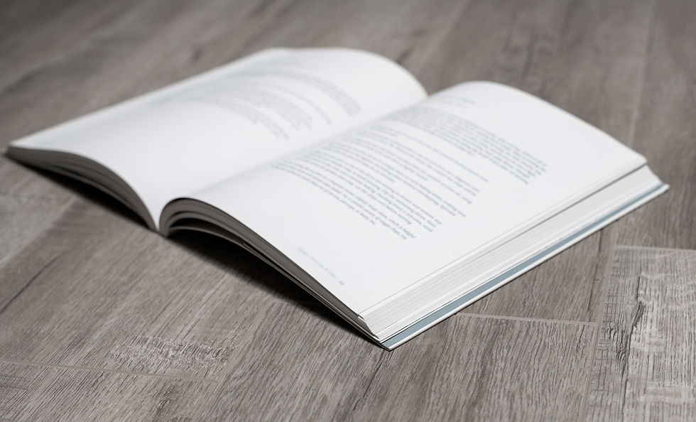
Common Mistakes to Avoid in Book Layouts
- waltsbookdesign

- Dec 11, 2024
- 2 min read
At Walt's Book Design, creating a professional book layout is key to making a lasting impression on your readers. Even minor errors can detract from the overall reading experience. Here are some common mistakes to avoid when designing your book's layout:
1. Inconsistent Margins and Spacing
One of the most noticeable issues in book design is inconsistent margins and spacing. Ensure that your margins are uniform throughout the book. Consistency in line spacing and paragraph spacing also contributes to a clean and professional appearance.
2. Poor Font Choices
Using too many different fonts or non-professional fonts can make your book look unorganized and amateurish. At Walt's Book Design, we exclusively use professional fonts to ensure your book looks polished and cohesive. Stick to one or two professional fonts for the body text and headings, and avoid decorative fonts for large blocks of text, as they can be hard to read.
3. Ignoring the Gutter
The gutter is the inner margin of a book, where the pages are bound. If you don't account for the gutter, text and images can end up too close to the spine, making the book difficult to read. Always add extra space to the inner margins to prevent this issue.
4. Misaligned Text and Images
Alignment is key to a professional-looking book. Text and images should be aligned consistently throughout the document. Misaligned elements can distract the reader and make your book appear unpolished.
5. Incorrect Image Placement and Quality
Low-resolution images or improperly placed images can detract from the reader's experience. Always use high-resolution images and ensure they are correctly positioned within the text. Consider the flow of the text around the images to maintain readability. At Walt's Book Design, we ensure all images are high quality and professionally formatted.
6. Neglecting Pagination
Proper pagination is essential for navigation. Ensure that all pages are numbered consistently, and the placement of page numbers is uniform. Also, make sure that the Table of Contents accurately reflects the page numbers.
7. Forgetting About White Space
White space, or negative space, is the area around and between elements in a design. It's important to balance your layout with enough white space to avoid a cluttered look. White space can help highlight important content and make the text more readable.
8. Overloading with Too Many Design Elements
While it's tempting to add various design elements to make your book visually interesting, too many elements can be overwhelming. Keep the design simple and focus on readability. Use design elements sparingly and purposefully.
9. Skipping the Proofreading Stage
Even a beautifully designed book can be marred by typos and grammatical errors. Always proofread your book carefully before finalizing the layout. Consider hiring a professional proofreader to catch any mistakes you might have missed.
10. Not Testing the Print Layout
Before sending your book to print, always test the layout by printing a sample copy. This allows you to see how the book will look in physical form and catch any issues that might not be apparent on screen.
By avoiding these common mistakes and utilizing Walt's Book Design's professional services, you can ensure a polished and professional book layout that enhances the reading experience. The meticulous attention to detail in design will showcase the effort and dedication you’ve invested in your work.


Comments